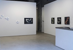
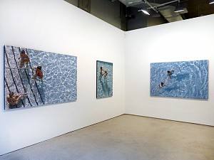
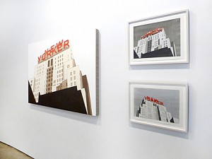
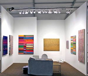
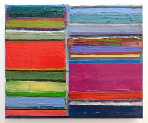
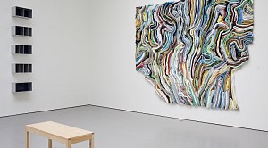
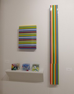
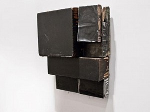
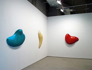
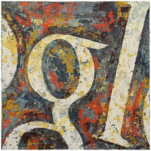
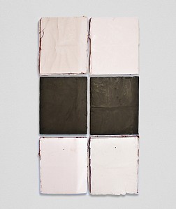
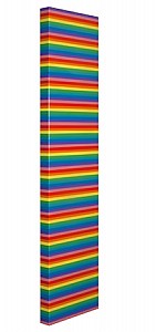
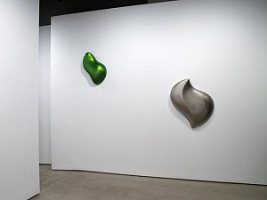
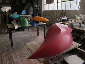
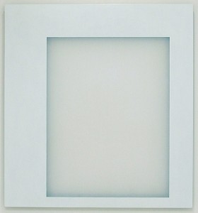
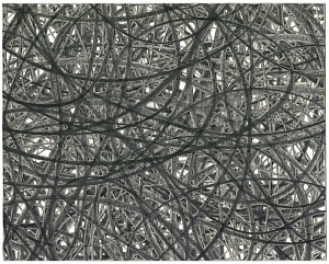
It is the case that Ted Larsen, an American artist who made his debut solo exhibition in Europe at the Private View Gallery of Turin, was born in 1964, the same year as the famous text from Donald Judd, Specific Objects. The new works exhibited here, created especially for the gallery spaces, presenting the artist's research, which springs precisely out of American minimalist art of those years. On display are a series of bas-reliefs, hybrids halfway between painting and sculpture, where Larsen comes away from the minimalist Dogma and retrieves a manual craft: each piece is in fact selected, cut and assembled according to the artist's own sensibility.
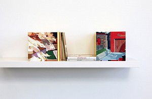
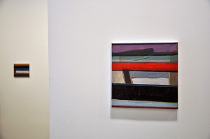
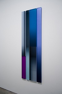
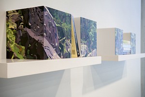
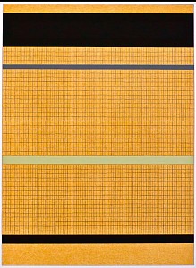
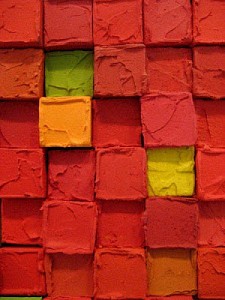
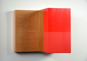
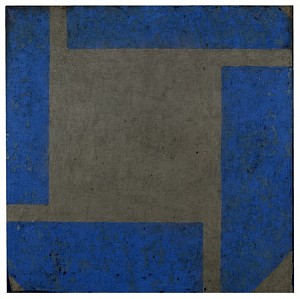
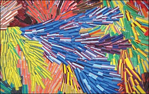
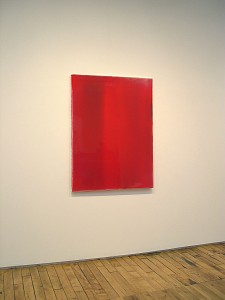
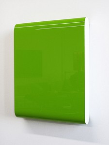
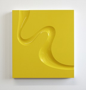
On display are a series of bas-reliefs, hybrids halfway between painting and sculpture, where Larsen comes away from the minimalist Dogma and retrieves a manual craft: each piece is in fact selected, cut and assembled according to the artist's own sensibility.
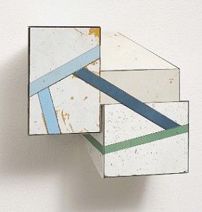
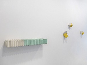
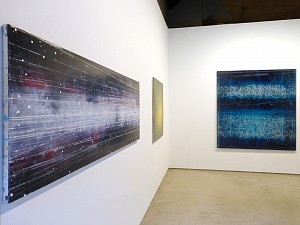
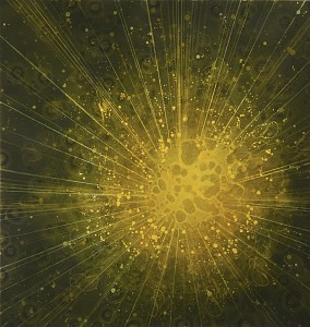
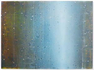
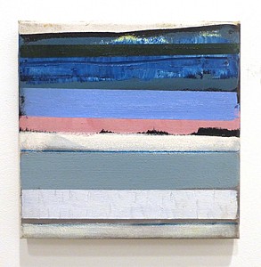
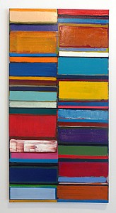
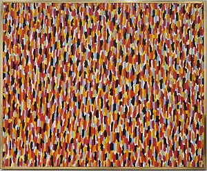
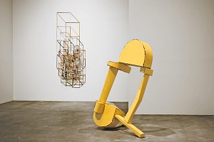
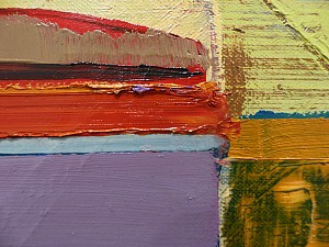
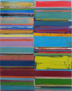
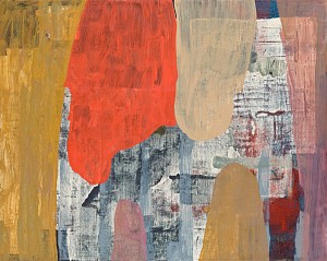
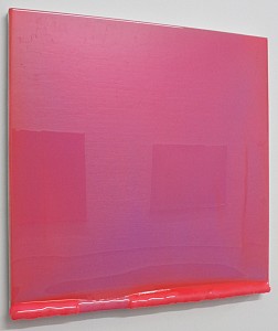
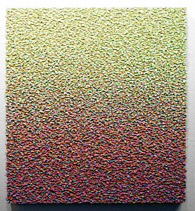
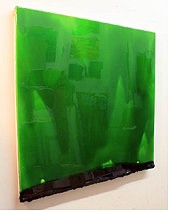
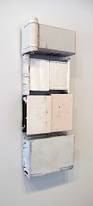
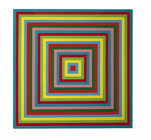
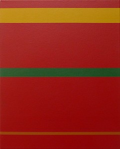
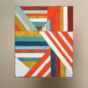
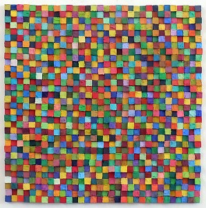
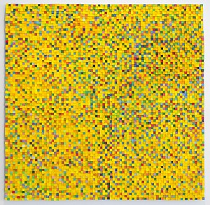
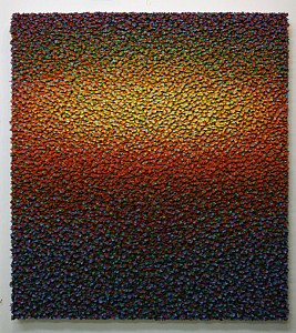
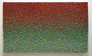
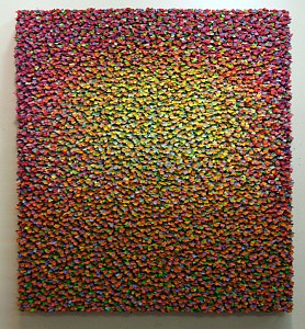
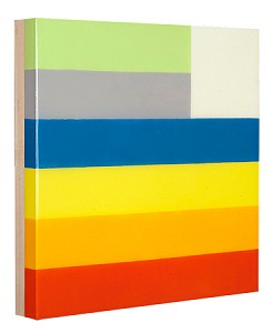
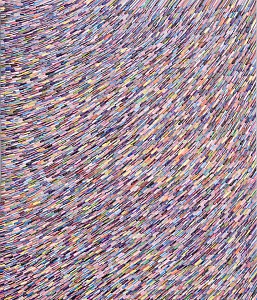
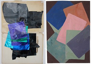
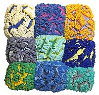
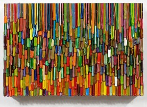
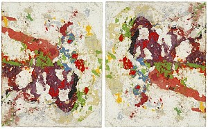
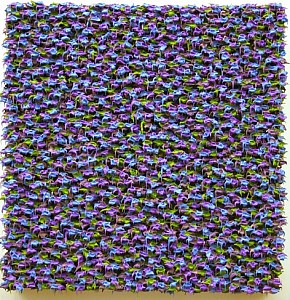
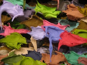
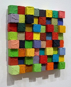
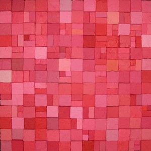
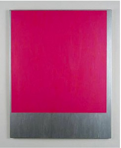
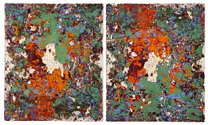
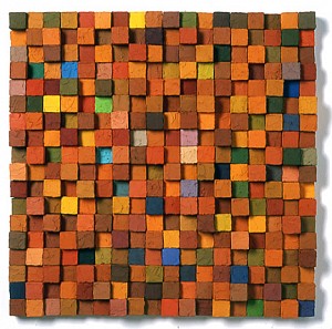
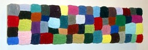
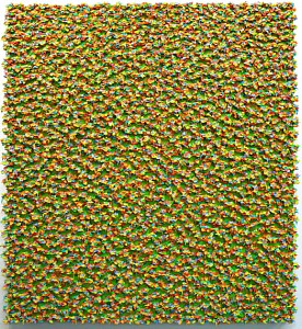
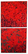
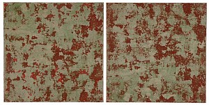
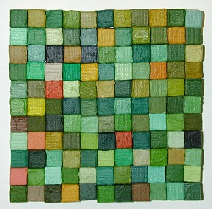
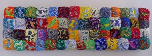
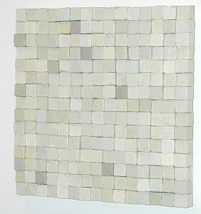
Reusing materials from old waste, such as sheet metal from cars and other materials, Larsen creates small paintings of composite geometries in which simple forms become complex agglutinations of polygons that expand and occupying space with their own visual projection and material footprint.
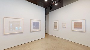
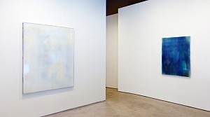
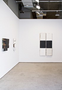
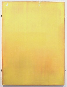
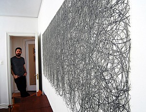
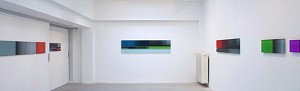
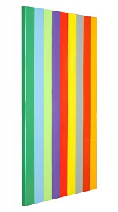
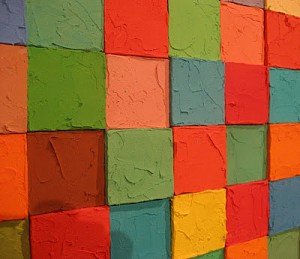
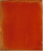
Arranged in the environment, the works create a measured path and rhythmically punctuated by projecting volumes from the walls; among them are chromatic references that guide the observer from one work to another. Color is important and Larsen devotes particular attention to it; using it, at times, to build a visual route, both inside the work and throughout the installation; others works recall the visual sensations of memory: the dull colors of old cars and Formica dinner tables of Americans who, with the marks of their use, carrying the ideas and universal references of the past.
Another element embodied by these works is the oxymoron tension created in the titles like Awfully Nice or Same Difference or True Fiction (all 2016); with these semantic juxtapositions, with no bearing on what the work is, Larsen gives uniqueness to each work and suggests an intuitive understanding and a sense beyond the brain and logic.